A not oft discussed topic in router reviews (which are a dime for a dozen on the web) is how to see just how much data your household is consuming.
Here I attempt to fill that gap by outlining the capabilities that my my router which is powered by Advanced Tomato provides. This is not a general review of the router software (which is excellent), but just some screenshots and some discussion about the bandwidth monitoring capabilities so that you can look before you leap, if you’re in the market for something that provides you with good statistics.
The router software provides two primary views by which you can monitor bandwidth usage. They are called “Bandwidth” which tracks total usage of the device across all it’s interfaces, and then there is “IP Traffic” which is useful if you want to get per-connected-device granularity. We’re only going to cover the bandwidth monitor, but you can be confident that the per-IP statistics are just as granular.
Realtime Bandwidth Usage
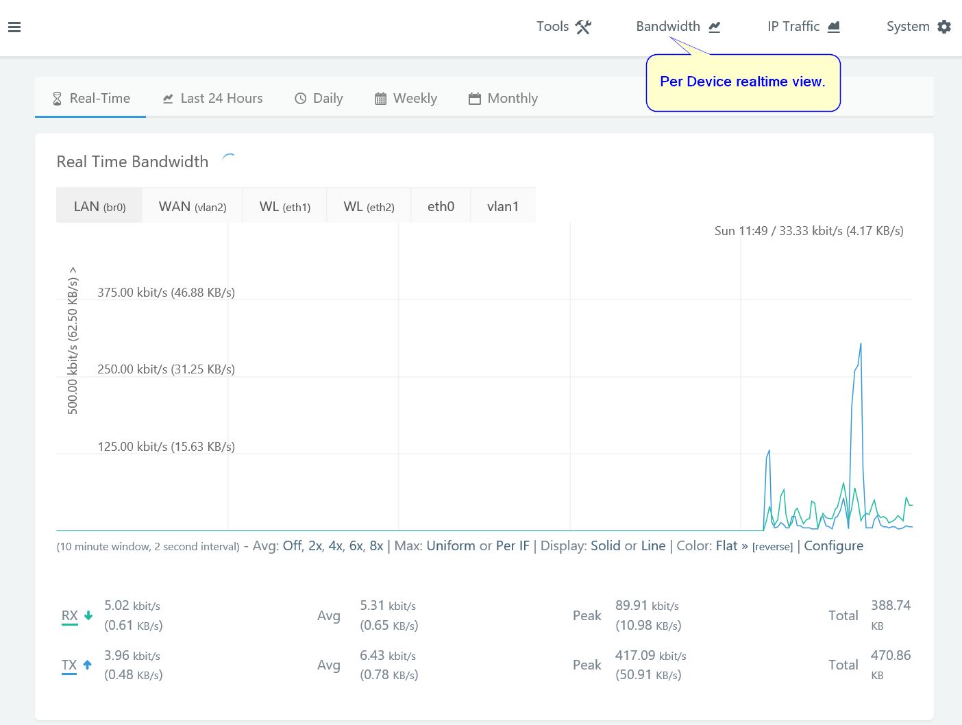
The realtime bandwidth page provides an instantaneous view of all the traffic going through the device. I personally struggle to make much sense of the way the view is subdivided. The LAN (br0) is the bridge that links all the interfaces on the device (the two Wifi Radios as well as the 4-port gigabit ethernet switch — I’m using an Asus RT-AC56U).
You’d expect whatever is shown in the WAN tab to be what’s actually leaving your local network onto the wider internet. WL (eth1) and WL(eth2) reflect the 2.4Ghz and the 5GHz wifi radios. It’s unclear what Eth0 represents, but between Eth0 and Vlan1, one or both of them represent the 4-port ethernet switch present on the device.
Last 24 Hours Bandwidth
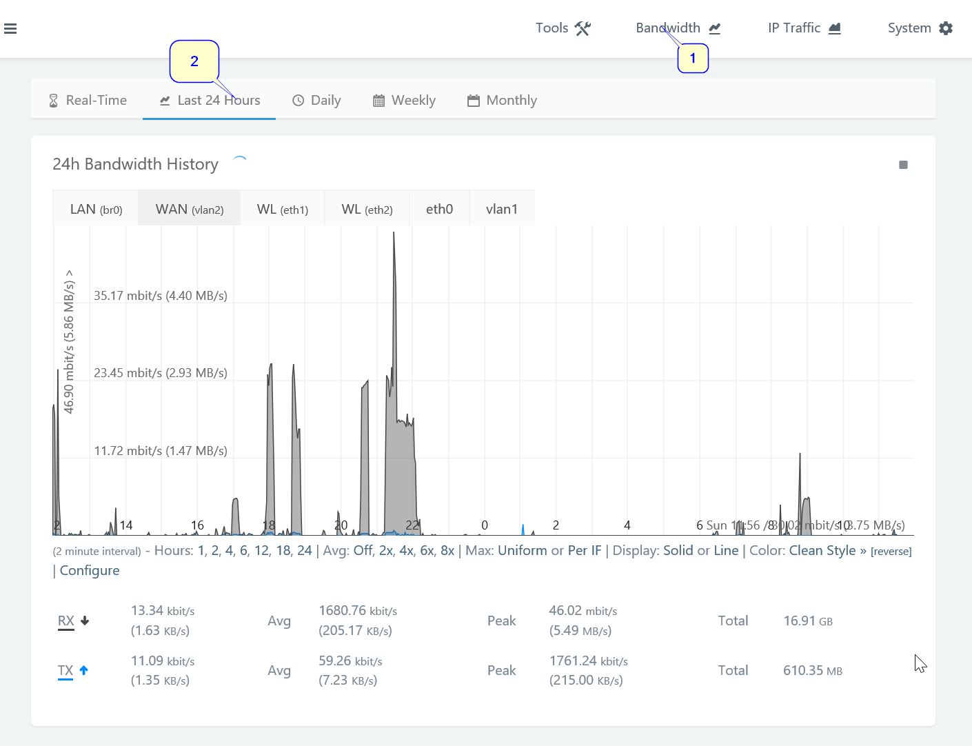
The 24 Hours Bandwidth chart is a little more interesting. Shown above is the WAN coverage. This presents a 24-hour view of the internet. The Y-axis shows the peak average speed and the X-axis represents time of day. Shaded areas represent times when data was being transferred. Grey shades represent downloads, blue-ish shades (which are hardly visible) represent uploads.
You can see that large file downloads will represent comparatively wider “mountains” on this graph, and the faster the download went, the taller the mountain will be. A small, fast download will be a very thin and tall mountain.
Daily Bandwidth Usage
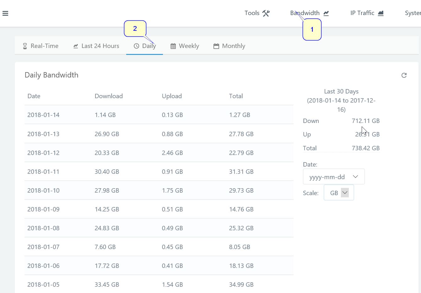
The total transfers done per day are detailed here, going as far back as your router storage permits. This is an aggregate of internet bandwidth usage across all devices over the date measured.
As you can see in the chart above, we did a lot of downloading/streaming on 2018-01-05.
A similar view is provided for the weekly bandwidth chart.
Monthly Data Usage

The most interesting chart to me is the monthly data usage. It allows me to see how much data we consumed going back as far as I want, grouped by month. The top-billed month would have been October 2017 if we didn’t have an unlimited Internet Connection.
There aren’t many routers out there that can provide this kind of information. The closest competitor I have found is Google Wifi, whose statistic go back at most 60 days. This is partly the inspiration for this post. I’ve been evaluating migrating to a multiple access point system in order to improve coverage in certain parts of the home, and it’s very difficult to find out how modern-day competition compares to this configuration in terms of usage statistics.
Discover more from nucco.org
Subscribe to get the latest posts sent to your email.